Cover Story, Part Two

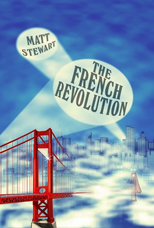
Last September this blog featured a guest post by DC-area writer and illustrator Goodloe Byron about his work on the cover for Matt Stewart‘s debut novel, The French Revolution. The book is now done—it officially comes out tomorrow, Bastille Day—and the cover went through plenty of fine-tuning between last fall and today. Byron describes the final stages of the process below. (Click on the images for larger versions.)

Every so often you’ll think you’re all set to go but then the cover hits the wall, by some mischievous book buyer, or by the second thoughts that inevitably come with time. The latter was the case in this instance. Matt and Denise [Oswald, editorial director of Soft Skull Press] became concerned that the guillotine was not prominent enough to register in peoples minds. [Editor’s note: Stewart writes: “I found people were missing the guillotine in the older version–there’s no missing it now. Guillotines should never be subtle.”] As I discussed before it was a miraculous stroke of luck that it had come out okay looking in the first place, so their suggestion seemed quite ominous to me. I quickly prepared this crude drawing to show them what their idea would look like and remind them of my natural limitations to realize it.

This did not horrify them as much as I’d intended and they still seemed to think it was a good idea. So I sat down and went into an autistic mode trying to draw a meticulous version of it, thinking that I may well get lucky again if I sat down long enough. Once again, I was surprised when they said that the end result was acceptable. Entropy of the mind enters at this stage of the process. If you draw a nice little stickman in a few seconds, you can easily appreciate all of its good qualities, the positioning of the arms or a particular facial expression. But when you spend a few hours shading in this or that, or moving the text here and there, it is inevitable that you will come to see it in a more negative light. Over time I slowly become fixated on the thought that it looked like a still frame from the original Ninja Turtles television series. This fixation is so deep that even now that is all I can think when looking at it.

So the brains were not working on a very high plane. When it came to the back I figured it would just have the same thing in there, minus the bridge.

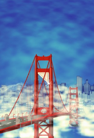
I knew in my heart that this was not a sufficiently creative answer, but I couldn’t think of anything else. Then I reread the notes from earlier and thought I would again throw out the idea of putting in some search lights.

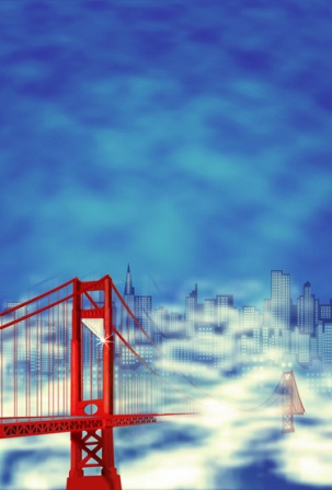
So I tossed it all in the pot and prayed that it would work out. They both seemed to like it well enough. We spent a bunch of time adding or subtracting fog. We were also uncertain what to do with the copy, specifically the blurbs and bios. Ordinarily Soft Skull books have lots of back cover copy, which can conceal a lack of imagination on the designer’s part. But Denise was very kind about editing down the text because she knew I would be heartbroken if I could not include my searchlights. So we cut out the bio and shortened some of the blurbs. We even added a blurb by Marie Antoinette, who is ordinarily very reserved with her praise, since she died especially.

Someone asked if we could toss in the Eiffel Tower, I think it was Matt’s idea. And so I spent some time drawing up a little version of it with Adobe Illustrator. But I think this idea of his was a very good one, as the tower looks very adorable to me. Now I imagine someone might object that the Eiffel Tower is not in San Francisco, nor did it exist at the time of the French revolution. But if something doesn’t work on second thought, that doesn’t mean that it doesn’t work. Supposedly a good designer is one who thinks about the first and second thought, but if you have to pick one, I’d say the second thought is not much of a priority.

Here is the final product. In the end, I did let Denise down a bit with the coloration, which she had thought would be white, red, and blue, as in the French tricolor. Though that had been my original intention I had long since forgotten it, and over time the blue had become more purple as I tried to get it more ominous looking. For that I felt some regret, but overall I think in the end we wound up with a pretty nice little cover here. The book is a satirical roman a clef of the French Revolution recast within a dysfunctional family in modern day San Francisco. Trying to capture that idea visually is a bit of a tall order, but I hope that some of it gets across. My two goals are that I want Denise and Matt to be happy with me, and I think they were moderately so, so I will call this a success!

One more note from Stewart: “If you look at the bottom left, you’ll see two ghost-ish images that look a little like jigsaw puzzle pieces. These are actually winches which support the painters who are always repainting the Golden Gate Bridge—which is constantly worn down from sea spray and wind. Nobody ever notices these “ghosts” unless I point them out, and you’d never know what they are unless you’ve been there a whole lot (I used to commute over the Golden Gate Bridge on my bike).”

Cover Story

Back in July, San Francisco-based novelist Matt Stewart began Twittering the contents of his novel The French Revolution. The effort not only got him some blog heat but a book deal as well: Last month Soft Skull Press announced that it will publish Stewart’s novel on Bastille Day, July 14, 2010.

That’s a way’s off, but the work getting the book ready for publication is happening now, and the task of designing the cover falls to Goodloe Byron, an artist who splits his time in Washington, D.C. and the Maryland suburbs. Byron has a number of Soft Skull covers to his credit—I’m particularly fond of his work on Matthew Sharpe‘s 2007 New World satire, Jamestown—and he was willing to open up his portfolio to show his progress on the novel so far. (Disclosure: I’ve worked with Byron in the past, editing a book review he wrote for Washington City Paper.)

“There’s a playfulness, but with an edge, to what he does that struck me as the right tone to accompany the humor and energy of Matt’s writing,” says Soft Skull editorial director Denise Oswald of Byron’s work. And though Byron stresses that has no formal artistic training and lacks many of the resources available to designers at larger houses, those are assets to Oswald’s mind. “Every cover is different and every artist is different,” she says. “I think Goodloe tends to riff on a lot of different ideas, so he sent me way more treatments than I might have expected. I think that’s particular to his process. The flipside is that we needed the cover on a much shorter schedule than normal and it prompted us to move quickly through a lot of different approaches and discard things that weren’t immediately working for us, rather than ruminate on one particular direction to follow or whether a promising idea that wasn’t working could be fixed.”

Authors aren’t always given much of an opportunity to collaborate on cover concepts—a fact that recently backfired in the case of the paperback of Justine Larbalestier‘s novel Liar. But Stewart was included in the process and encouraged to submit examples of what he liked. “I went back and looked at lists of ‘best covers’ and they tended to be a simple but interesting image, so I wanted something simple that says it all—and pops,” he says. “We’re trying to encapsulate some pretty big themes and complex storylines here, but two critical elements are 1) a San Francisco epic and 2) loosely structured on the historical French Revolution. The Golden Gate Bridge and the guillotine are the natural symbols for those, and combining them in an interesting way is absolutely awesome.” (Incidentally, Stewart is a D.C.-area native; his father is author David O. Stewart.)

Byron’s cover concepts are below, along with his comments. Oswald emphasizes that the cover is still very much a work in progress. “After the editor, author, and designer are settled on a direction, the cover has to fly by the publisher, publicity, marketing, the sales force, and to a certain extent the booksellers,” she says. “If anyone along the line raises serious reservations that ring true to us, then we could find ourselves back at square one.” I’ll pick up the story again once The French Revolution is published; here’s how the story looks now.

fr1

It is always very risky to represent the characters directly, especially if you’re going to show them to the author. Certain kinds of images and illustrations are fine, but the moment you start to have more than one character on a cover the image seems to become less of an evocation of the style of the book than a direct representation of the characters and events, which authors are very touchy about (understandably). So this one was immediately put on the back burner to see if Matt would warm up to it.

fr2

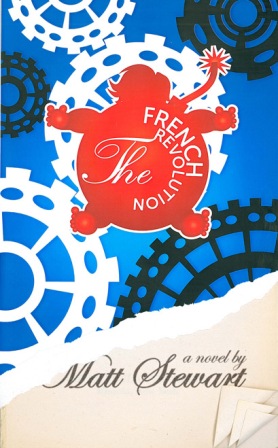
I stopped working on the first drawing fairly confident that they would reject it or provide me with some notes that would require starting over. Denise wanted me to illustrate the cover, something akin to Confederacy of Dunces, but I decided at this point that I would just send her totally random ideas so as to be well diversified in the event that thought the drawing quality and adherence to detail was awful. In the book, the progenitor of the revolution is an extraordinarily large woman, which I had not represented well in my first illustration, as it seemed like it would have been difficult to do it in that style without mocking her obesity. The children are also mixed race, which I didn’t bother representing very well either. So i thought, well I should do something that shows I read the book. Then I did this delightfully pudgy red thing. It was only then that I thought, you know, if I add a fuse to that thing and make it a bomb then maybe we’re good to go. As it turns out, both Denise and Matt were charmed by the illustration, but they didn’t think it was all that usable.

fr3

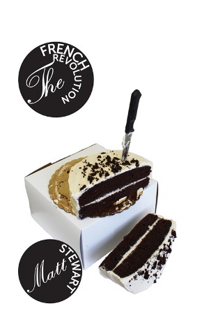
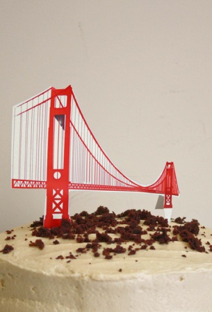
This was a mock-up of an idea using images from the Internet, which obviously you can’t do when you go to print. So I showed it to them hoping that they wouldn’t like it, as then I would have to find a cake to photograph, needless to mention the well documented difficulties of finding a miniature guillotine…

fr4

So while I was scrambling to distract them from that I started printing out covers and then tearing them up and scanning them back in. Unfortunately it was now that Matt sent over his list of favorite book covers, which included the whole of the New York Times best book covers of 2008, so I got a bit nervous. A very popular meme today is that kind of quirky/Fascist Art Deco thing as seen in the cover to The Mayor’s Tongue, so I started trying to lob things in that direction.

fr5

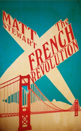
Denise thought that she would like the cover to have an image of the Golden Gate Bridge with a guillotine. As soon as people stop asking for drawings of sinister men with mustaches I get a bit nervous that I’m out of my element, so I took a long time to draw the bridge, even though I wanted to keep it two-dimensional for the moment. Shading it realistically was beyond the scope of my powers so I really hoped this one would languish on the vine before revealing my inability to do anything realistic.

fr6

Personal favorite! I drew the little grandma and then executed her with a paper cutter, then taped it over some red paper to be vaguely bloodish (but trying to keep it very physical, more as if it were violence against an illustration than a violent illustration) Denise was now keen to the bridge idea, they wanted to add some fog and to give it a sinister San Fran feel.

fr7

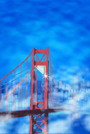
In desperation, I tried using a wide array of Photoshop effects to shade the bridge for me, but they really couldn’t help me out.

fr8

Instinctively returning to my last place of safety and comfort, I cut up the illustration and added some wild evil eyes looking down on the city, trying to rip off Rodrigo Corrall’s beautiful cover for The Savage Detectives. The French Revolution is also a book above all about these cartoonish, almost surreal characters, in that sense I felt it would be a shame to have a cover without any humans on it to relate the strange and aggressive quality of the world. A single facial expression is the most versatile and meaningful image, and figuring out one that is appropriate can make up for a great lack of technical ability… I liked this one as well.

fr9

Thank god! It was my birthday and at my day job they gave me a cake! So I got out my camera and started taking pictures of it in the hopes of wooing them back over to idea number 3. But, of course, nobody in the office thought to give me a little guillotine for my birthday, a much less observed tradition.

fr10

So I tried to print out the bridge and stick it on there, but that wasn’t working. So then I thought of the idea of executing the cake itself, much as I had done to the old woman. Alas, this was another death in vain and they wanted to see a more realistic bridge.

fr12

So then I sat there for a few hours redrawing the bridge and guessing what the shading would look like, I thought I was in over my head but it started to come together. “If you can’t do something well, do it meticulously” is the lesson, I guess.

fr13

They also wanted an image of San Francisco in the background. This wasn’t that hard as there was going to be fog, and as such the only building that would matter is the Transamerica pyramid anyways, so I figured i could draw it in Adobe Illustrator. I took a long time with it drawing in all the little squares for windows, as at this point I was committed to the deception of fooling them into thinking I had some technical ability.

fr11

So then I added in some Batman style search lights. My thought was that the city of San Fran was calling out a frantic ‘S.O.S’, and then they were receiving one right back in exchange. It seemed like a good idea at the time, and I wanted to draw some silhouettes of a family of monsters attacking the city on the back, as I thought that would be adorable.

fr14

So nobody was game for the spotlights, but I didn’t want to have the title be straightforward, as then I would have nothing to distract people from the illustration, which by now looked absolutely horrible to me from having stared at it for so long and noticed all of its faults of perspective… So I cut up the font like it had been cut on the guillotine, thinking that might do the job.

fr15

And then Denise and Matt decided that the drawing was good enough and that I should just typeset it normally for the moment.